Styling
Suchi comes with some basic styling to quickly setup an article or page. However, you can easily style the Index according to your design.
The fastest way to style the article according to your sites brand color is by using the accentColor prop in Index. The accentColor is applied to the active Indicator and active Index Item.
You can also target the accentColor using CSS variables as show below:
Mastering React Hooks
Introduction
Getting Started
Advanced Techniques
Best Practices
Conclusion
Colors
Suchi uses some CSS Variables to apply colors to various Suchi elements.
| Variable | Default | Target |
|---|---|---|
| --suchi-accentColor | hsl(9, 100%, 59%) | Active index item and indicator |
| --suchi-inactive-indicator | hsl(0, 0%, 65%) | Inactive indicator |
| --suchi-inactive-item | hsl(0, 3%, 34%) | Inactive items in the Index Tray |
| --suchi-background-color | hsl(0, 0%, 100%) | Background Color for the Index Tray |
| --suchi-scrollbar-color | hsl(0, 0%, 69%) | Scrollbar color in the Index Tray |
You can use a custom color palette for your page by replacing these CSS Variables.
Use the !important flag while styling to override default CSS styling.
Example:
Styling Elements
Learn about the various Suchi Elements here.
Indicators
Indicators are organized within a <ul> tag.
To style or target the indicators, use the attribute selector [data-suchi-indicators]. Each indicator, represented by an <li> element, can be targeted using [data-suchi-indicator].
The indicator corresponding to the section currently in view will have an "active" state: [data-suchi-indicator="active"]. All other indicators will default to the "inactive" state: [data-suchi-indicator="inactive"].
Mastering React Hooks
Introduction
Getting Started
Advanced Techniques
Best Practices
Conclusion
The active indicator takes the --suchi-accentColor CSS Variable while the inactive indicators take the --suchi-inactive-indicator CSS Variable.
Sample styling
For example, lets add variable thickness to the indicators.
Index and Index Items
There are two types of Index - MobileIndex and DesktopIndex. Only one of these Index are rendered based on the toggleWidth prop passed to the Root. See more details here.
Desktop Index
All items in the desktop index are wrapped inside a <div> element that can be targeted using the attributes [data-suchi-desktop-items].
Each item in a <button> element that can be targeted using the attributes [data-suchi-desktop-item].
The item corresponding to the section currently in view will have an "active" state: [data-suchi-desktop-item="active"]. All other items will default to the "inactive" state: [data-suchi-desktop-item="inactive"].
Mastering React Hooks
Introduction
Getting Started
Advanced Techniques
Best Practices
Conclusion
By default, the active item takes the --suchi-accentColor CSS Variable while the inactive items take the --suchi-inactive-item CSS Variable.
Sample Styling
For example, lets add some styles to the active index item.
Mobile Index
The mobile index is wrapped within a <div> element that can be targeted using [data-suchi-mobile]. This element is used to position the mobile index as fixed at the bottom of the screen.
The index items are wrapped in a <div> element that can be targeted using [data-suchi-mobile-items]. Each item in a <button> element that can be targeted using the attributes [data-suchi-mobile-item].
Sample Styling
For example, lets add some styles to the active index item.
Overlay
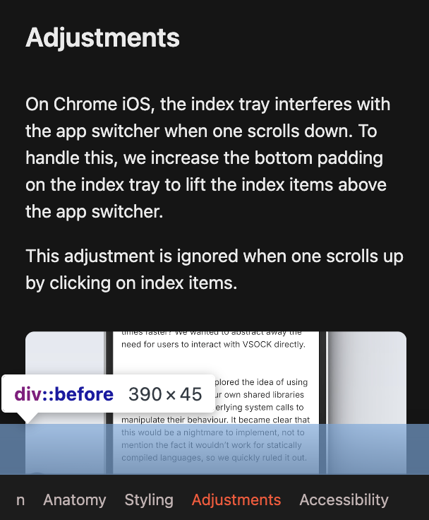
The Mobile Index has an overlay above Index Tray to give the idea of depth for the underlying content.
You can target the overlay by using [data-suchi-mobile]::before.
